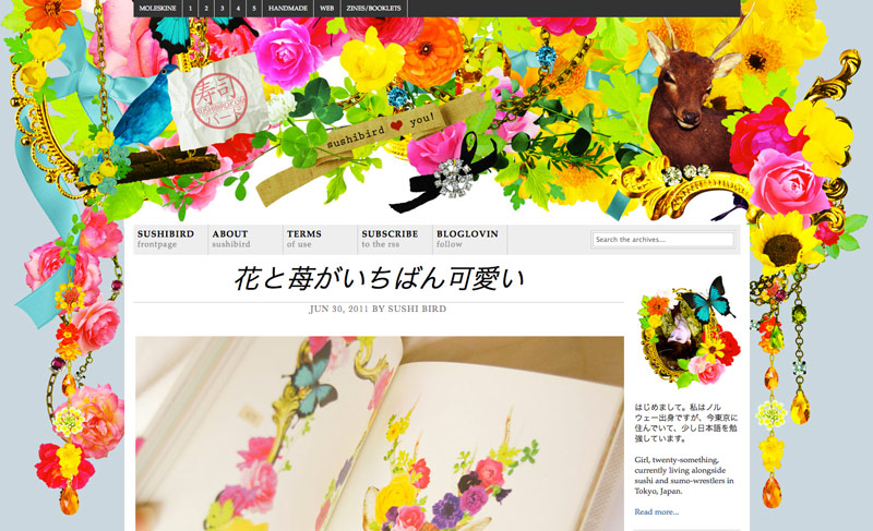
A *tiny* redesign
Jul 1, 2011 by Sushi Bird

Oh dear. I seem to have redesigned the website. Now – if more is more calls for a price, I think I have already won. I know it is a lot of stuff going on here, but I just needed something happy and fun! I wonder how long I can stomach looking at this before changing back… Oh well, it is summer and fun in the sun after all!
Jeg ble litt overrasket da jeg logget meg inn på Bloglovin, «Sushibird-siden ser jo ikke sånn ut?», men så gjenkjente jeg cliparten. ^^ Jeg liker forandringen – masse farger og moro! : D
Takk skal du ha… Følte jeg gikk litt over styr og stell her, men så tenkte jeg – søren heller – jeg kan jo bare endre det igjen dersom jeg ikke orker å se på alle fargene.
I love it, Miss Sushibird! It is so full of life! 😀
Thank you 😀 I wonder if it is a bit too full of life, but it was a nice change 🙂
superfint! 🙂
Aw, takk 😀
Det ble kjempefint!!! 😀
Tusen takk skal du ha… Det ble litt… mye, men jeg tror jeg liker det for øyeblikket 🙂
Elsker fargene! Marte approves!
Tusen takk skal du ha… Det ble plutselig veldig mye, men jeg tror jeg liker det nå om sommeren 🙂
Supersøtt! 🙂 Liker det veldig godt!
Takk! Jeg var litt usikker på om alle leserene mine ville slutte å lese nå siden det så ut som noe hadde eksplodert på toppen her, men nå ble jeg glad 🙂
Absolutt nydelig! Ja, det er mye som skjer, men det er veldig morsomt 😀
Tusen takk. Jeg trengte noe morsomt og kjekt å se på, jeg var blitt litt lei av det forrigje designet.
O___O THIS NEW LAYOUT IS GORRGEOUS!!! I love the new header so much more!!
Did you use any tutorials to aid you with the process?
xx
Thank you so much! To be honest I was a bit worried that my readers would flee the blog because of the explosion on top here, so it made me so happy to get some positive feedback 🙂 I really wasn’t sure if it was just in my head it looked cute, or if others could appriciate this as well.
& I didn’t use any tutorials, I just took a screenshot of the site (old version), opened the screenshot in photoshop, cut the old design into layers, moved the parts where I wanted them, and then just designed the new background image and the header image on layers over the original screenshot (by tossing together the images). After that I made the old layers/images from the original screenshot invisible and saved the new layers I had tossed together as the background image. Then I made the layers for the logo on top, made the new background-image layers invisible and cropped the image to fit the logo, and saved the logo as png. After that I uploaded the images, and fixed the html and css in coda (that is a really awesome text-based editor for mac), and I was done. The entire thing from start to finish took me about 2 hours.
I have never been good at working with visual editors, I prefer to just edit the html and css by hand, it is much faster for me.
This is fabulous! Very suitable for summer, I agree 😀 And I think you did a lovely job, as even though there are a LOT of stuff up there, it doesn’t look cluttered at all. Well done, girl 🙂
Hoho, I take that as a great compliment when it comes from the fashion consultant! Thank you! I am not the most fashionable thing out there – sometimes the things I think look incredible, all the real fasionistas have told me that the things I like are big no-nos from time to time 😉 I was kind of thinking that with this design as well (it looks good in my head, other people see it as someone see it as a unicorn that has exploded). I really like people like galadarling.com and the like, people like that dare to be different, and I think that their amazing persona shine through so they can pull off the outrageous outfits they show of.