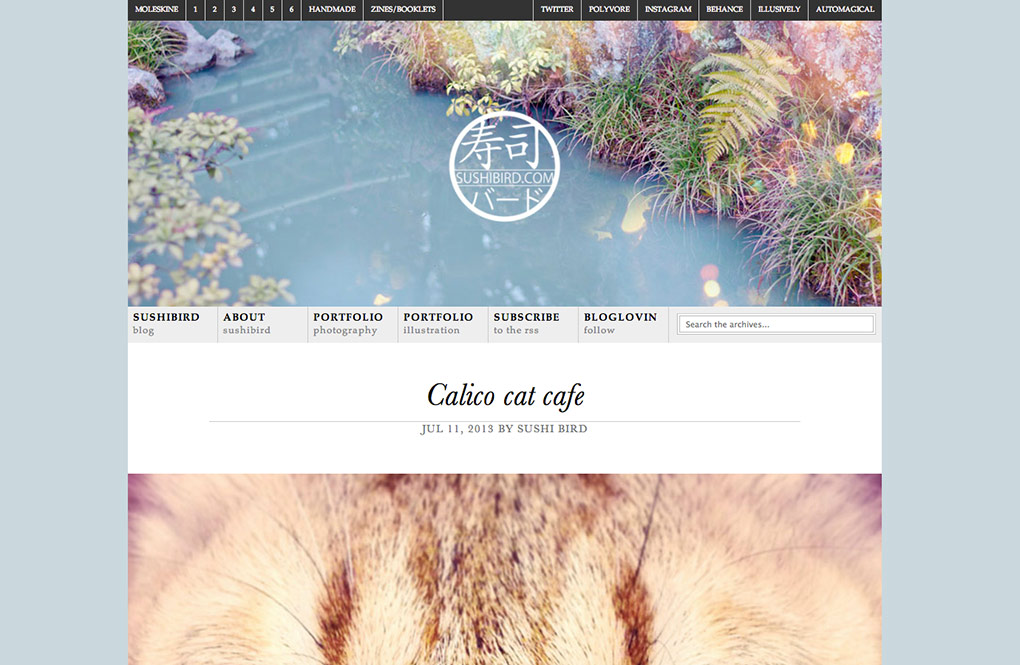
New design – bigger is better!
Jul 11, 2013 by Sushi Bird

Good ideas always seem to come to me at 3:30 in the morning in the middle of my last week of exams, so I redesigned Sushibird. It looks a lot cleaner and less cluttered than the previous version, and the pictures are quite a bit larger. Yay? Nay? Vad tycks?
I love the wider format, and the design is really clean. I miss the hand-drawn feel of the old site, but I’ll get used to this new one.
Your pictures are giant! 🙂 I really enjoy the new size of everything.
Thank you for the feedback. I still have some quirks to figure out, but I will get around to that when I have time. I am still getting used to the size myself, but I figured, it is mostly a photo-blog, so why not just show big pictures in the first place. Before, it was always a problem with too long loading times for big pictures, but these days people have good internet connections, so the previous problems are not that relevant anymore.
Yay!
🙂 yay for gode ideer klokken 3:30!
“Good ideas always seem to come to me at 3:30 in the morning in the middle of my last week of exams…”
Oh, I definitely know that feel.
http://s3.amazonaws.com/theoatmeal-img/comics/making_things/4.jpg
The new design is good. Cleaner, as you say – although the old one definitely had a charm of its own! Sometimes it’s just time for a change. Change can be nice. When it’s not scary. As for the picture sizes, I couldn’t tell you what’s better for the life of me. I keep alternating between large, post-width pictures – and smaller ones, neatly stacked in a table. Lately I’ve been thinking maybe I should make a system to it, perhaps use larger sizes when posting pictures of something specific (mountain range panorama, moose in the sunset), and then the smaller arrays for random shots (people on the street, a flower here and a cat there). I don’t know! Ranting.
Skriftlig dansk er lettere enn skriftlig svensk, og muntlig svensk er lettere enn muntlig dansk! 😉
I have trouble with the same thing, it is always hard to find one format that fits it all.
& takk for tilbakemelding angående svensk og dansk også. Jeg tenkte det samme, men oppdaget at jeg i det siste synes svensk er lettere å lese enn dansk. Det er mulig det er fordi jeg har lest veldig lite dansk de siste årene.
Har vel strengt tatt ikke lest lengre tekster på verken svensk eller dansk på en stund selv. Min erfaring baserer seg hovedsakelig på å måtte velge mellom bruksanvisninger på tysk, svensk eller dansk; ender oftest på dansk… 😛
Det går fint helt til de begynner med tall! Total confusion ensues.
Å herregud – danske tall. Jeg hadde helt glemt danske tall.
Yes the new design is better for me. Cleaner, easier to view and even looks more professional… in a good way that is. Love it
Thanks for stopping by! I think I like the new one better as well, but I fear it doesn’t look as personal as before? In any case, it was time for a change.
The new design looks great I will still miss the old one I always thought your header was one of the best I’ve ever seen. =
Thank you! I think I will miss the old header as well, it seemed a bit more alive than this one, but I just really needed a change to see if it made me want to blog more again. So far, so good.